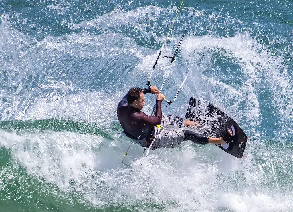
Kitesurfing School Website Structure: Lessons, Levels, Equipment and Booking
A potential customer visiting a kitesurfing school website usually has a very practical goal. They want to understand whether kitesurfing is right for them, which lesson fits their level, how much it costs, what equipment is included, and how they can reserve without having to send five messages first.
The problem is that many kitesurfing websites make those answers harder to find than they need to be. Lessons are sometimes grouped without clear explanations, beginner and advanced options are mixed together, equipment details sit on a completely different page, and booking buttons appear before visitors fully understand what they are being asked to book.
A strong kitesurfing school website structure should remove that friction and organize the site around customer decisions rather than the internal organization of the school. The goal is to guide a visitor from curiosity to confidence and then to booking with as few unnecessary steps as possible.
This is especially important in international destinations, where many visitors may be trying kitesurfing for the first time. The website should make the activity feel understandable, safe, and approachable before asking someone to choose a package or enter payment details.
Why Website Structure Matters for Kitesurfing Schools
Kitesurfing is not a simple tourism product. A customer may need to understand skill levels, lesson formats, wind conditions, equipment, safety, location, pricing, and how many hours of instruction are appropriate before they feel ready to book.
That means the website has to support more decision-making than a typical activity page. If information is poorly organized, visitors may leave even when they are genuinely interested, simply because they are unsure which option applies to them.
A good kitesurfing school website structure presents information in the same order customers naturally think about it. First, help them understand whether the sport is suitable for them. Then help them identify their level, compare lesson options, understand what is included, and finally move toward booking.
This kind of structure improves both user experience and conversion because visitors do not have to jump between unrelated pages to understand the offer.
Start With the Questions Customers Actually Ask
Before thinking about menus, page count, or design, it is useful to look at the real questions potential students ask before booking. These questions reveal the information hierarchy the website should follow.
Most visitors want to know things such as:
- Can I learn kitesurfing if I have never tried it?
- Which lesson should I choose?
- How many hours do I need?
- Can intermediate riders take coaching?
- Is equipment included?
- Do I need to bring anything?
- Are lessons private or group-based?
- What happens if there is no wind?
- Where are lessons held?
- How much does everything cost?
- How do I book?
The website should answer these questions without forcing visitors to search through multiple pages. When the answers are easy to find, the site becomes easier to use and the path toward booking feels much more natural.
Build the Main Navigation Around Customer Decisions
A kitesurfing school’s navigation should be simple enough that a first-time visitor can understand it within a few seconds. Visitors should not need to learn the school’s internal terminology before they can find the right lesson.
A practical structure might look like this:
| Main Navigation | Purpose |
|---|---|
| Kitesurfing | Main service and destination overview |
| Lessons | All lesson options |
| Levels | Beginner, intermediate and advanced |
| Equipment | Rental and included gear |
| Location | Wind conditions and teaching spots |
| Prices | Packages and costs |
| FAQ | Practical questions |
| Book | Reservation process |
Not every item necessarily needs to become a separate page. Smaller schools may combine levels, prices, and equipment within one strong lessons page, while larger schools may benefit from dedicated sections for different customer groups.
The important point is that the navigation should follow how customers think about the experience. It should not mirror the operational structure of the business if that makes the site more confusing.
Create a Strong Kitesurfing Pillar Page
The main kitesurfing page should act as the central overview of the experience and connect visitors to the rest of the website. This is the best place for the Kitesurf pillar internal link because it can introduce the activity while helping users move toward more specific information.
A strong pillar page can explain:
- what kitesurfing is
- who can learn
- available lesson levels
- the destination
- typical wind conditions
- safety
- instructors
- equipment
- lesson formats
- booking options
The page does not need to explain every detail in full. Its role is to help visitors understand the overall offer and quickly identify the next page that is relevant to them.
For example, a complete beginner should be able to reach beginner lessons immediately, while an experienced rider should be able to find equipment rental or advanced coaching without scrolling through introductory information that does not apply to them.
Organize Kitesurfing Lessons by Level
One of the most useful changes a kitesurfing school can make is clearly separating lesson options by experience level. This reduces confusion and helps visitors feel that the school has a clear path for different types of students.
Beginner, intermediate, and advanced categories are usually easy for customers to understand, as long as each level includes a short explanation of who it is designed for.
Beginner Kitesurfing Lessons
Beginner pages should be written for people who may know almost nothing about the sport. The language should be simple, reassuring, and focused on what happens during the first stages of learning.
A beginner lesson page may explain:
- basic safety
- equipment setup
- kite control
- launching and landing
- body dragging
- first water starts
- expected progression
The page should avoid assuming that visitors already understand terms like edging, upwind riding, or depower. If a technical term is necessary, explain it in plain language so that the customer does not feel lost before the lesson even begins.
For most beginners, the biggest question is not about kite size or wind direction. It is whether they can realistically learn the sport, so the content should answer that concern early.
Intermediate Kitesurfing Lessons
Intermediate students usually have different goals. They may already be able to ride but still struggle with consistency, transitions, going upwind, or controlling their speed.
A good intermediate page can focus on skills such as:
- riding more consistently
- staying upwind
- improving transitions
- controlling speed
- improving stance
- handling the kite more efficiently
This also helps communicate that lessons are not only for first-time students. Many schools unintentionally lose repeat customers because their websites give the impression that instruction ends once a rider gets onto the board.
Advanced Kitesurfing Coaching
Advanced riders usually know what they want and need less explanation about the basics. However, they still need to understand the type of coaching available and whether the school offers instruction suitable for their goals.
Advanced coaching may include:
- jumps
- wave riding
- strapless riding
- foil
- freestyle
- transitions
- technique refinement
These pages can be shorter than beginner pages, but they should still make the scope clear. If certain coaching depends on specific wind conditions, equipment, or rider ability, that information should be explained before booking.
Help Customers Identify Their Level
Simply labeling pages “Beginner,” “Intermediate,” and “Advanced” does not always solve the problem because some visitors are unsure where they belong. A rider who can stand up but cannot stay upwind, for example, may not know whether they are still a beginner or already intermediate.
A useful kitesurfing school website structure includes short level descriptions that help customers self-select before they click into a package.
| Level | Typical Rider |
|---|---|
| Beginner | Never tried kitesurfing or still learning kite control and water starts |
| Intermediate | Can ride but wants more consistency, better upwind riding or transitions |
| Advanced | Independent rider working on jumps, waves, foil or advanced techniques |
This small section can reduce a surprising amount of uncertainty. It also makes lesson comparisons easier because customers can identify the category that best matches their current ability.
Explain Lesson Formats Clearly
Customers should understand whether lessons are private, semi-private, group-based, hourly, or part of a multi-day package. Each format has different advantages, and those differences should be visible before the booking stage.
A simple comparison table works well:
| Lesson Type | Best For | Main Advantage |
|---|---|---|
| Private | Individual students | Maximum instructor attention |
| Semi-private | Couples or friends | Shared experience and lower cost |
| Group | Small groups | Social and affordable |
| Multi-day package | Beginners or progressing riders | Structured progression |
Private lessons may appeal to students who want more individual coaching, while semi-private lessons may work well for couples or friends traveling together. Multi-day packages can be especially useful for beginners because they provide a clearer progression path instead of treating each session as an isolated activity.
The visitor should understand these differences before they reach the booking form. Hiding lesson formats until checkout can create unnecessary hesitation.
Explain How Many Hours a Student May Need
Lesson duration is another common source of confusion. A visitor may see packages for 2, 6, 9, or 12 hours without understanding why they would choose one over another.
The website can make those options easier to compare by connecting them to approximate learning stages. For example, a short session may introduce kite control, while a longer package may give a beginner more time to progress toward water starts and independent riding.
A simple explanation might look like this:
- 2–3 hours: introduction, safety, and basic kite control
- 6 hours: more time for body dragging and early water-start practice
- 9–12 hours: more complete beginner progression toward independent riding
These should always be presented as approximate learning paths rather than promises. People progress at different speeds, and wind conditions also affect how quickly certain skills can be practiced.
Make Equipment Information Easy to Find
Equipment is one of the biggest points of uncertainty for first-time students. Many visitors do not know whether they need to buy or rent a kite, harness, board, helmet, or wetsuit before taking a lesson.
The website should clearly explain what is included in each lesson. This information is important enough to appear directly on lesson pages rather than being hidden inside the FAQ.
Typical equipment may include:
- kite
- control bar
- board
- harness
- helmet
- flotation vest
- communication system
- wetsuit when necessary
A clear equipment section reduces uncertainty and also helps communicate value. When customers understand that the price includes both instruction and specialized gear, the cost of the lesson often becomes easier to evaluate.
Separate Equipment Rental From Lessons
Equipment rental serves a different type of customer from beginner instruction. Someone renting equipment is usually already an independent rider and has a different set of questions.
A rental page should therefore explain:
- available equipment
- brands or sizes
- skill requirements
- certification requirements
- rental duration
- damage policy
- insurance
- wind-related limitations
Keeping rental information separate from lessons avoids confusion. A beginner should not have to decide whether they need to “rent” the same equipment that is already included with their lesson.
Use the Location Page to Reduce Travel Uncertainty
Location information can influence conversion almost as much as price. Travelers need to understand where lessons happen and how easily they can reach the teaching area from their hotel or accommodation.
The location section or page can explain:
- teaching beach or lagoon
- distance from popular tourist areas
- transportation options
- meeting point
- typical water conditions
- wind season
- water depth
- beach conditions
This information is particularly valuable in tourism destinations where customers may not know the geography. A school can also explain why the teaching area works well for learning, such as shallow water, open space, or predictable seasonal winds.
The visitor is not only choosing a school. They are also choosing where they will spend several hours learning, so location should feel like part of the experience rather than a small logistical detail.
Explain Wind Conditions Without Making the Page Too Technical
Wind information is important in kitesurfing, but the average beginner does not need a detailed meteorology lesson. The website should explain enough for the customer to understand the season and the factors that may affect scheduling.
Useful information can include:
- main kitesurfing season
- typical wind range
- whether mornings or afternoons tend to be better
- water temperature
- what happens when conditions are unsuitable
If conditions vary significantly throughout the year, a simple table can help:
| Season | Typical Conditions | Best For |
|---|---|---|
| Peak wind season | More consistent wind | Lessons and regular riding |
| Shoulder season | More variable conditions | Flexible travelers |
| Low season | Fewer suitable days | Check availability in advance |
The information should always reflect the actual destination. Generic wind descriptions copied from another location can create unrealistic expectations and do little to help the traveler.
Put Pricing Near the Decision Point
Pricing should appear close to the lesson description, duration, and inclusions. If customers have to contact the school just to discover the cost of a standard beginner lesson, some will simply leave and compare another operator.
A strong pricing section should show:
- lesson type
- duration
- number of people
- what is included
- price
- booking option
This does not mean every custom request needs a fixed public price. Private groups, specialized coaching, or unusual packages can still use custom quotes when necessary.
The goal is transparency. Customers should understand the normal cost of the core offer before they are asked to commit.
Use Calls to Action According to Customer Readiness
Not every website visitor is ready to book the moment they arrive. Someone discovering kitesurfing for the first time may need more information before they feel comfortable choosing a package.
Calls to action should therefore match the stage of the customer journey. A homepage might use Explore Kitesurfing Lessons, while a level section might use Find Your Level. On a detailed lesson page, View Prices or Book Your Lesson may be more appropriate.
This creates a smoother progression because each call to action helps the visitor take the next logical step. Asking someone to “BOOK NOW” repeatedly before explaining the lesson can make the site feel pushy rather than helpful.
Design the Booking Page for Conversion
Once someone reaches the booking stage, the objective changes. The visitor no longer needs another long explanation of why kitesurfing is exciting; they need a quick and understandable reservation process.
The booking form should ask only for information that is necessary at that stage, such as:
- name
- contact information
- lesson type
- experience level
- number of people
- preferred date
- preferred package
- relevant notes
Additional details can be collected later if needed. Long forms create friction, especially when travelers are booking from a phone.
The booking page should also make deposits, cancellation rules, and wind-related policies easy to understand. If customers know exactly what happens after payment, they are more likely to complete the process with confidence.
Explain What Happens After Booking
One of the simplest UX improvements is explaining what happens immediately after the customer reserves. This removes uncertainty and makes the business feel organized.
For example:
- Select your lesson and preferred date.
- Pay the required deposit.
- Receive your booking confirmation.
- The school confirms conditions before the lesson.
- Meet your instructor at the agreed location.
If wind conditions affect scheduling, explain that process clearly as well. Customers should know whether lessons are rescheduled, refunded, or moved to another suitable day.
This information can prevent unnecessary messages while also reducing hesitation at checkout.
Optimize the Mobile Experience
Many travelers research and book activities from their phones, sometimes after they have already arrived at the destination. A kitesurfing website therefore needs to work particularly well on mobile.
Priorities should include:
- readable text
- simple menus
- large booking buttons
- easy-to-read pricing tables
- WhatsApp contact
- simple date selection
- fast-loading images
- clear lesson categories
Avoid complicated tables or layouts that require users to zoom in and out. The UX hub internal link fits naturally within this section because mobile usability is part of the wider conversion experience.
A useful test is to complete the entire process from a phone as if you were a first-time customer. If finding a lesson, checking the price, or finishing a booking feels difficult, the structure probably needs improvement.
Keep WhatsApp as an Option, Not the Entire Booking System
WhatsApp is extremely useful for tourism businesses because it allows visitors to ask quick questions, confirm conditions, and communicate directly with instructors. However, forcing every customer to start a conversation before they can see prices or availability can slow down the buying process.
A better structure offers both options:
Book Online
and
Ask Us on WhatsApp
Customers who already know what they want can book immediately, while those who need help can still contact the school.
This approach gives visitors flexibility without turning WhatsApp into a replacement for basic website information.
Use Photos to Answer Questions, Not Only Decorate the Website
Kitesurfing naturally produces dramatic imagery, but photos should also help customers understand the experience. A gallery full of advanced riders performing huge jumps may look impressive, yet it can make a complete beginner wonder whether the school is suitable for them.
Useful images can include:
- beginner instruction on the beach
- instructor and student together
- equipment setup
- shallow-water training
- water-start practice
- intermediate riding
- advanced coaching
- teaching location
- group lessons
A strong website shows progression rather than only the most advanced version of the sport. That helps potential students recognize themselves in the experience.
Add Instructor Information Where It Builds Trust
Customers are trusting an instructor with specialized equipment, wind, and water conditions, so instructor credibility plays an important role in conversion.
A concise instructor section can include:
- certification
- years of experience
- languages spoken
- teaching specialties
- local experience
The information should be reassuring without becoming a long professional biography. Most visitors simply want to know that the instructors are qualified, approachable, and experienced with students at their level.
This is particularly important for beginners, who may already feel nervous about trying the sport.
Add Reviews Near Important Decisions
Reviews can be more effective when they appear close to the decisions customers are making. Instead of placing every testimonial on one separate page, use a few relevant reviews within lesson, pricing, and booking sections.
For example, a beginner lesson page could include feedback from someone who started with no experience. An intermediate page could feature a rider who improved their transitions or finally learned to stay upwind.
This makes social proof more specific and believable. Visitors can see that people with similar goals have already had a positive experience with the school.
Avoid Making Every Service a Separate Page
More pages do not automatically create a better website. A school may not need separate pages for every package variation, particularly when the search intent and customer questions are almost identical.
For example, separate pages for a 2-hour, 3-hour, 6-hour, and 9-hour beginner lesson can create unnecessary duplication. In many cases, one strong beginner page with a clear comparison table is easier to understand.
The same principle applies to UX. Too many similar pages force visitors to click back and forth simply to compare small differences.
A clear, consolidated structure is often more useful than creating a separate URL for every possible option.
Build a Simple Conversion Path
A strong kitesurfing school website structure should make the customer journey predictable and easy to follow.
A clear path might look like:
Landing Page → Choose Level → Choose Lesson → Review Price and Equipment → Book
Each step answers the next logical question and moves the customer closer to a decision.
Compare that with a more confusing journey such as:
Homepage → About Us → Services → Activities → Watersports → Lessons → Contact Us → WhatsApp
Every unnecessary step gives visitors another opportunity to leave.
The best structure is usually the one that gets customers to the information they need with the fewest possible detours.
Common Website Structure Problems for Kitesurfing Schools
Problem 1: Beginners Do Not Know Which Lesson to Choose
A long list of packages without explanations can create uncertainty, particularly for first-time students.
Solution: Organize lessons by level and explain the skills associated with each category. Short descriptions can help visitors identify the right starting point without contacting the school.
Problem 2: Prices Are Hidden
If visitors have to message the business just to learn the price of a standard lesson, some will leave before making contact.
Solution: Show regular package pricing and clearly explain what is included. Use custom quotes only when the service genuinely varies.
Problem 3: Equipment Information Is Missing
Beginners may assume they need to buy or rent equipment separately if the site does not explain what comes with the lesson.
Solution: Add a clear equipment section directly to relevant lesson pages and separate independent rental information from student equipment.
Problem 4: Booking Buttons Appear Too Early
Constant booking prompts can feel aggressive when the visitor has not yet understood the offer.
Solution: Use different calls to action depending on whether the customer is exploring, comparing, or ready to reserve.
Problem 5: Mobile Booking Is Difficult
Small buttons, long forms, and complicated calendars can quickly frustrate mobile users.
Solution: Test the complete booking journey on multiple phone sizes and remove anything that does not need to be completed before checkout.
Problem 6: The Website Is Built Around the Business, Not the Customer
Menus often reflect internal categories rather than the way travelers actually think.
Solution: Organize the experience around level, lesson type, price, equipment, location, and booking. These are the questions customers are already trying to answer.
Recommended Kitesurfing School Website Structure
A streamlined site does not need dozens of pages. It needs a clear hierarchy where each page has a specific purpose and naturally guides customers toward the next step.
Home
Introduce the school, destination, main lesson categories, reviews, and primary booking route. The homepage should make it obvious within a few seconds what the school offers and who the lessons are for.
Kitesurfing
Use the main Kitesurf pillar page to explain the activity, destination, season, and overall experience. From here, visitors can move toward lessons, equipment, and booking information.
Lessons
Organize options by:
- Beginner
- Intermediate
- Advanced
Each level should include package comparisons, inclusions, pricing, and clear booking links.
Equipment
Explain what is included with lessons and provide separate information for independent equipment rental. This helps prevent beginners from confusing rental with lesson equipment.
Location
Cover teaching areas, wind season, transportation, meeting points, and water conditions. The page should help travelers understand where the experience takes place and what conditions they can expect.
Prices
Provide clear package comparisons with duration, group size, and inclusions. Visitors should not need to calculate the value of each option themselves.
FAQ
Answer common questions about age, swimming ability, equipment, weather, cancellations, wind conditions, and preparation.
Booking
Keep the form simple and explain confirmation, deposits, weather policies, and what happens after payment.
This structure gives potential customers the information they need without turning the site into a maze of similar pages.
UX Checklist for a Kitesurfing School Website
Before launching or redesigning the site, test whether a first-time visitor can answer the most important questions within a few minutes.
Check whether they can:
- immediately tell that the school offers lessons
- identify their skill level
- find the correct lesson
- see the price
- understand what equipment is included
- find the location
- understand what happens if there is no wind
- understand the booking process
- complete a booking easily from a phone
- contact the school if they still have a question
If several of these tasks are difficult, the website likely has unnecessary friction. Fixing those gaps can improve conversion even without adding more traffic.
FAQs About Kitesurfing School Website Structure
Should beginner, intermediate, and advanced lessons have separate pages?
They can, especially when each level has enough unique information to justify its own page. Larger schools may benefit from separate pages because customers can reach the exact experience they need more quickly.
Smaller schools can use one detailed lessons page with clearly separated sections for each level. The best structure depends on the amount of content, search demand, and complexity of the services offered.
Should kitesurf schools publish prices online?
In most cases, clear pricing improves the customer experience because visitors can decide whether the activity fits their budget before contacting the school.
Custom coaching or special group requests can still use request-based pricing where necessary. The important thing is not to hide basic pricing without a good reason.
Should equipment rental have its own page?
Usually yes if equipment rental is a meaningful standalone service. Independent riders have very different needs from beginner students and are likely to search specifically for rental information.
If rental is only a minor service, it can be included within a broader equipment page rather than creating another unnecessary URL.
How many calls to action should a page have?
There is no perfect number. The more important consideration is whether each call to action appears when the visitor has enough information to take the next step.
Repeating a booking button after key sections can be useful, while placing aggressive CTAs after every paragraph can make the page feel cluttered.
Is WhatsApp enough for kitesurfing reservations?
WhatsApp works well for questions, weather updates, and direct communication, but it should not be the only way visitors can understand pricing or reserve a standard lesson.
Offering online booking and WhatsApp together usually provides a better experience because customers can choose the level of assistance they need.
What information is most important on a beginner lesson page?
Visitors should quickly understand who the lesson is for, what they will learn, how long it lasts, what equipment is included, the price, the location, basic safety information, and how to book.
The page should also explain progression in simple language so beginners know what they can realistically expect from the experience.
Build the Website Around the Student’s Decision
The best kitesurfing school website structure is not necessarily the one with the most pages, animations, or elaborate design elements. It is the one that helps potential students understand the experience and make decisions without unnecessary confusion.
A beginner should quickly know where to start. An intermediate rider should be able to find coaching without reading through basic instruction, while an independent rider should easily locate rental information. Every customer should be able to understand pricing, see what is included, and reach the booking process without taking unnecessary detours.
For kitesurfing schools and other marine tourism operators, Romti can help structure websites around SEO, user experience, and conversion rather than treating those areas as separate projects. A website may attract plenty of visitors, but traffic only becomes valuable when users can quickly understand what to book and how to book it.


 French
  Spanish
  English